 |
| Original art work for the song 'Up All Night' |
 |
| Art work for the album Neighbourhoods |

Dude ranch is the second album by blink 182. This is where I took inspiration for the shape of the booklet. Because I am only doing work for one song, I did not want to have a whole booklet. So I preferred the idea of this folded page. Also the simplicity of this folded page lends itself to the genre. Pop Punk has always thrived on being unconventional and different. Taking influence from bands such as The Sex Pistols. It is conventional for an album to have the bands name, and then follow on with the album name, for example 'Angels and Airwaves - We don't need to whisper' or 'Green Day - American Idiot' However the sex pistols wanted to be unconventional, so they named there album 'Never Mind the Bollocks - heres the Sex Pistols' Therefore creating a booklet that wasn't a conventional Album booklet fitted itself in the punk conventions.

In my video I originally had a scene where George finds the photos in his girl friends room, and in frustration throws them on to the ground in the street. I wanted the picture for my front cover to therefore be on the street where he has thrown the photos.
Because the Album that the single is from is called Neighbourhoods I wanted to show the town in the background, to give the art work somewhat of an urban feel. And Because the song is called 'Up All Night' I felt it was important to have the stars and moon in the background.
It later on occurred to me that I could make the street sign say 'Blink-182' as if this is the name of the street. And the title 'Up All Night' was going to be graffiti on the wall next to him. This was to al be done with a white pen on black paper. From these ideas I then created the demo's.

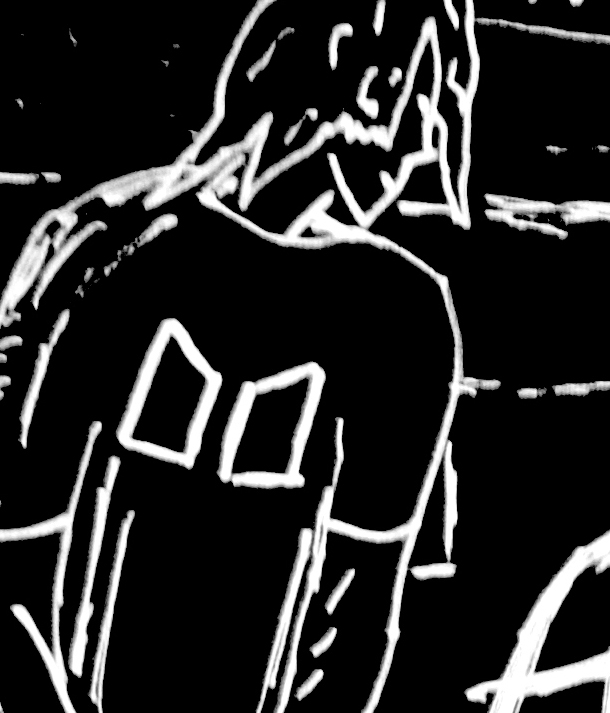
With the demo's complete I knew what I wanted in the picture so I started to draw the proper version. I wanted to be sure that the character on the front could and maybe not be George. I gave him slightly different clothing because I wanted him to come across as anyone who has been in this particular situation. He represents every guy having these troubles with his girl friend.
I tried to create a character that represented the general listener to bands like 'Blink-182'. He is wearing skinny, black jeans, that he is wearing quite low down his body, and this is why he appears to have a large torso. By wearing his jeans like this his is able to show his belt, which is a common way to dress within the pop punk community. The top and shoes are also from the clothing line 'Macbeth footwear' and this is the clothing line of Tom Delonge, the singer and guitarist of Blink-182.
 |
| Here is a picture of Tom Delonge wearing a Macbeth T-Shirt. |
I also noticed that in the art work for Neighbourhoods every time you see the letter 'N' it is inverted. So in my art work, unless typed, all of the N's are inverted.
 |
| The inverted 'N' in the Blink-182 art work |
 |
| The Inverted 'N' in my art work |
 |
| Initial Blink-182 smiley from 2003 |
 |
| Smiley in the album art for my music video |

The magazine advert combines both the black and white sketch theme and the video together. I chose a shot from the video where George is desperately running through the rain. The shot is dynamic and energetic, and I felt it was the most obvious choice for the magazine advert. The dark space allowed for the image to still have little colour, and be in keeping with the theme of the other art. The writing is all in the graffiti/sketched font that I have tried to create, apart from the release date, which I felt was best to keep in a straight forward front. The image with so much black looked too plain, so I experimented with placing the smiley logo faintly in the background and this worked incredibly well, and added an extra element to the advert to grab the viewers attention.

This is the design for the DVD itself. All the blink 182 CD's since 2003 have had the smiley logo on, so I thought I needed to show the smiley on this DVD, but in the design of the rest of the art work. The Smiley logo is the same one I have used for the other parts of the product. It looks like a scratched on, graffiti styled smiley. The words 'Blink-182' and 'Up All Night' are the same fonts used in other parts of the product. The CD therefore fits in completely with the rest of the art work.
The legal information on the DVD is an ordinary and simple font. It is to the point and is not part of the art work. Most CD designs seem to have the legal information written on the CD, but as well as doing this to make my work look like a real product. However considering recent debate about using copyrighted songs, I have wanted to show through my product that all of the rights are reserved for Blink 182, and the their record companies. I am advertising on my product that anything to do with the song belongs to the band and record companies. The only aspect that I am taking credit for is the video and the art work to go with it.

THE VIDEO
Note: I created a voice over video for this, but my schools internet stopped working and I was unable to upload it. This is what I have done Instead.
SCRIPT for voice over that will go over my video, explaining how the video fits 'Pop Punk' codes and conventions.
The begining starts with the photo from a recent party coming to life. This reflects conventions from previouse pop punk videos, including 'Bowling For Soups' 'Girls all the bad guys want' Where the girl is watching all the events of the video from a TV screen, the video starts and ends with the girl onlooking the events. This is why George is onlooking the events of his past break up through these photos.
The break up was an important part of the video. Pop Punk thrives on teenage angst, and lots of pop punk videos are focused on troubled love. The video for 'I write sins not tragedies by 'Panic! at the disco' is focused on a woman cheating on her boy friend after she storms out of her own wedding. Despite the fact that Society expects men to cheat on woman, In the pop punk culture, this is usually reversed. Woman or girls are depicted to be less innocent, however still hugely desirable. This is why despite her over reaction due to the events, George is willing to do anything for her.
Neighbourhoods is the first blink 182 album in 8 years and in this time blink 182 have gone from immature young adults, to ordinary adults. They are no longer pop punk kids, there writing has matured, and the subject matter darker. This therefore made me want to set the tone for the video as dark and hopeless. So compared to many pop punk videos, this video hopefully reflects the change in maturity, that the band themselves have gone through.